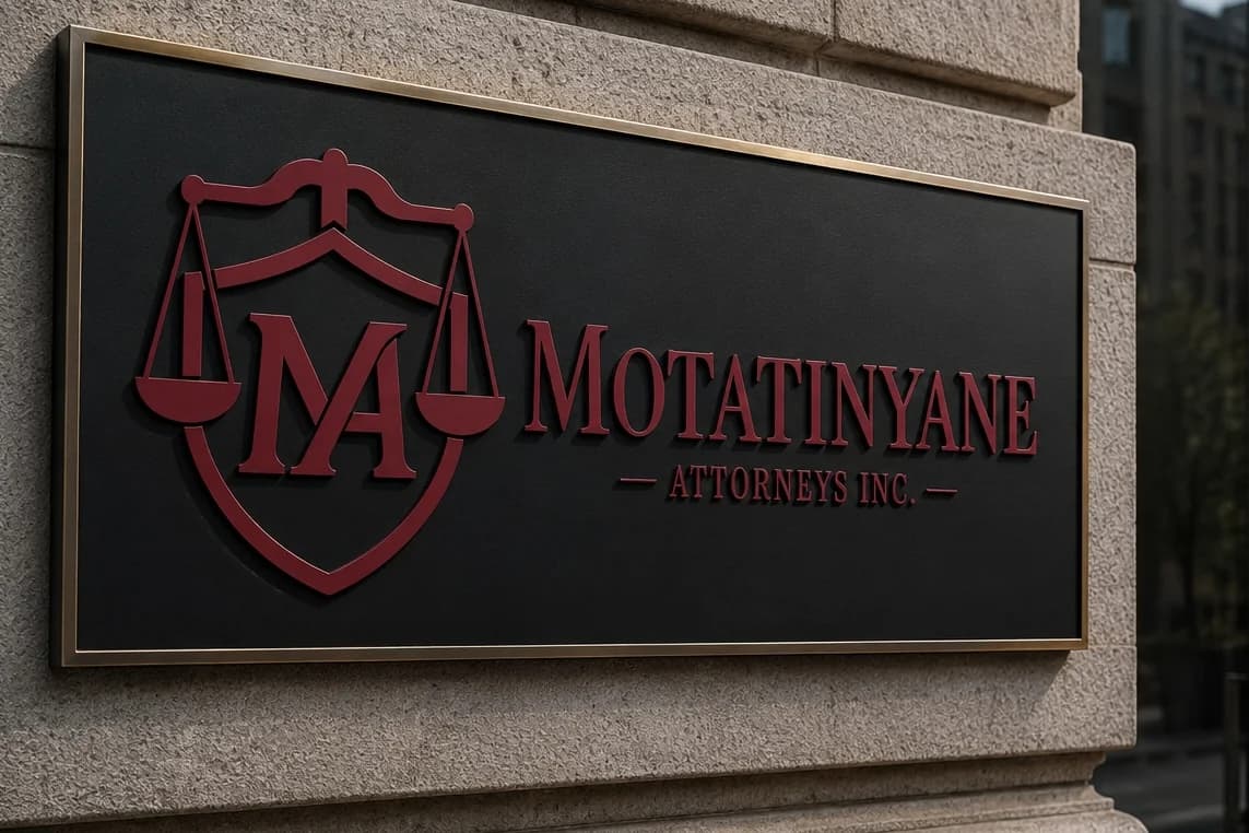
• Create a modern, professional logo for Motatinyane Attorneys that stands out from typical law firm branding.
• Incorporate legal symbolism (scales of justice and a shield) to communicate fairness, trust, and protection.
• Integrate the “MA” initials into the design to build a strong and recognizable brand identity.
• Use burgundy as the primary color to convey sophistication, authority, and uniqueness within the legal industry.
• Maintain a clean, balanced, and timeless design that remains versatile across different applications.
The design process began with research into traditional law firm branding to understand common visual language within the legal industry. This included analysing competitor logos and identifying recurring elements such as scales of justice, shields, columns, and serif typography. The goal was to understand what makes legal branding feel professional, while also identifying patterns that often lead to generic or overused designs.
From this research, I defined the direction: a logo that maintains legal symbolism and professionalism, but avoids clichés and overly complex compositions. Burgundy was selected based on its strong association with authority, sophistication, and trust, while offering a more distinctive alternative to the typical dark blue and black palettes used in law firms.
The initial design phase involved multiple sketches and digital explorations focusing on different combinations of the shield, scales, and the “MA” monogram. Several concepts leaned too heavily into traditional layouts, while others lacked the required level of professionalism or balance.
Through multiple iterations, the design was refined by simplifying forms, improving symmetry, and ensuring the “MA” integration felt natural rather than forced. Unnecessary details were removed to maintain clarity and scalability across different uses.
The final outcome was achieved after testing and comparing several variations, ultimately selecting the version that best balanced uniqueness, simplicity, and professional identity while still clearly representing the legal field.
The primary typeface used for Motatinyane Attorneys is Instrument Serif, chosen for its refined, professional, and authoritative appearance, which aligns with the legal field while maintaining a modern feel.
The “MA” logomark is a custom-designed monogram where the letters M and A are merged into a single cohesive form. This was created to strengthen brand identity and ensure a unique, recognizable symbol rather than using a standard type-based arrangement. The monogram was carefully constructed to maintain balance, legibility, and symmetry, allowing it to function effectively as both an icon and a standalone brand mark.
This combination of Instrument Serif typography and a custom “MA” monogram results in a distinctive identity that feels both professional and original.
Three final logo variations in different colour versions: Burgundy, Burgundy & Grey, and Grey
Each logo set included in multiple layout formats:
• Vertical logo with name
• Horizontal logo with name
• Logo mark only
• Name only
Final files delivered in four formats for versatility and professional use:
• SVG (scalable vector format for print and editing)
• PDF (print-ready format)
• PNG (transparent background for digital use)
• JPG (standard use format)
This ensured the client had a complete and flexible brand identity package suitable for both print and digital applications.
The final outcome was a cohesive and professional brand identity for Motatinyane Attorneys that successfully balances tradition with a modern and unique visual approach. The use of a custom “MA” monogram, combined with legal symbolism and a refined burgundy palette, resulted in a distinctive logo system that stands apart from typical law firm branding.
The client received a complete identity package with multiple logo variations and formats, ensuring flexibility across digital and print applications. The final designs were well-aligned with the firm’s vision of professionalism, trust, and authority while still maintaining a fresh and unique visual identity.
The client responded positively to the final direction, particularly appreciating the uniqueness of the monogram and the overall simplicity of the system. The multiple layout options also provided practical value for different use cases such as documents, signage, and digital branding.
"I had a great experience working with TechturSolutions. They designed a logo for me and really listened carefully to all my ideas and requirements. The team was easy to communicate with, professional, and very supportive throughout the process.
They also gave helpful suggestions on what would work best for my brand, which I really appreciated. Their guidance showed strong creativity and understanding of design.
They were responsive and put in the effort to ensure quality work and client satisfaction. I would definitely recommend TechturSolutions to anyone looking for reliable and professional design services."
M
Ms. Tshireletso Motatinyane
Managing Director · Motatinyane Attorneys Incorporated
Love Our Work?
Let's create something amazing together for your brand.
Start a Project With Us